

简介:
教程分为两步,添加 CSS 样式和添加 HTML 代码即可
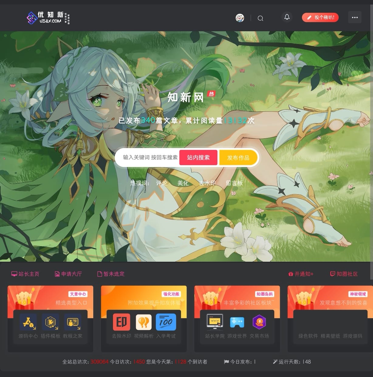
效果图:

1.子比主题设置—>自定义代码—>自定义 CSS 样式,添加以下 CSS 代码:
.zhankr-zx {
  position: relative;
  margin-bottom: 18px;
  display: flex;
  -webkit-box-align: center;
  align-items: center;
  -webkit-box-pack: center;
  justify-content: center;
  line-height: 1;
}
.zhankr-zx:before {
  margin-right: 10px;
}
.zhankr-zx:after {
  margin-left: 10px
}.zhankr-zx:before, .zhankr-zx:after {
  content: "";
  display: inline-block;
  width: 8px;
  height: 8px;
  background: linear-gradient(-125deg, #f95491 0%, #2953fd 100%);
  border-radius: 50%;
}
.zhankr-zx span {
  font-family: Futura;
  background: linear-gradient(-125deg, #f95491 0%, #2953fd 100%);
  -webkit-background-clip: text;
  color: transparent;
  font-size: 49px;
  letter-spacing: 5px;
  display: inline-block;
  font-weight: 700;
}.zhankr-zx .zhankr-zx-n {
  font-size: 20px;
}
.zhankr-zx .zhankr-zx-n strong {
  display: block;
  font-size: 20px;
  background: linear-gradient(-125deg, #f95491 0%, #2953fd 100%);
  -webkit-background-clip: text;
  color: transparent;
}
.HhcatboxDes {
  position: absolute;
  opacity: 0;
  z-index: 1;
  align-items: center;
  display: flex;
  font-size: 16px;
  height: 180px;
  justify-content: center;
  width: 100%;color: #fff;
  font-weight: 600;
  background: #f95491;
  -webkit-transition: all 0.35s ease-in-out;
  -moz-transition: all 0.35s ease-in-out;
  transition: all 0.35s ease-in-out;
  -webkit-transform: translateY(100%);
  -webkit-transform: translateY(100%);
  -moz-transform: translateY(100%);
  -ms-transform: translateY(100%);
  -o-transform: translateY(100%);
  transform: translateY(100%);
}
.HhCooltitle {
  margin-top: 10px
  }
感谢您的来访,获取更多精彩文章请收藏本站。

© 版权声明
THE END


![自定义子比主题底部footer页脚美化(自适应)[08.30更新]-程序猿](https://www.oove.cn/wp-content/uploads/2023/08/753de466a7125113.png)


![zibll子比主题配置不同类型用户文件上传格式、上传大小限制教程[V7新功能]-程序猿](https://www.oove.cn/wp-content/uploads/2024/05/zibll子比主题配置不同类型用户文件上传格式、上传.png)


暂无评论内容